

When faced with a visualization problem, it can often be resolved visually rather than analytically. In the process of creating a product with visualization, you may encounter situations where the desired result is not achieved, and the inclination is to solve the problem analytically. However, visual techniques can sometimes offer the solution. This is common with maps.
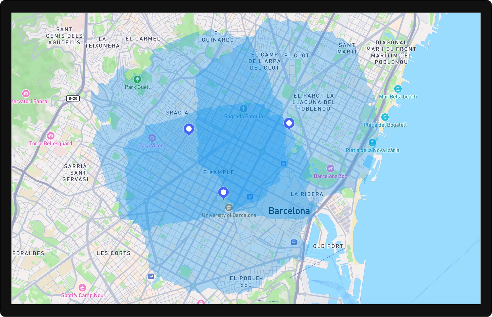
Here’s an example. Imagine you are a delivery service in Barcelona and need to display coverage zones for your clients in an application. You have several warehouses, each with a restriction: orders will only be fulfilled if the travel time from the warehouse to the client is no more than 30 minutes.
The map prepared in Mapbox Studio
To see the streets and buildings, the zones need to be displayed as semi-transparent. However, as shown in the image, overlapping zones will obscure the city map, making it hard to read.
To improve readability, these zones need to be merged into a single area. The initial thought might be to solve this analytically. However, this approach has its drawbacks:
- Additional calculations/coding
- If your map data updates, the area needs to be recalculated each time
There is a visual solution if you are using Mapbox/Maplibre for your maps. Simply tell Mapbox that the area is actually a 2.5D object with zero height.
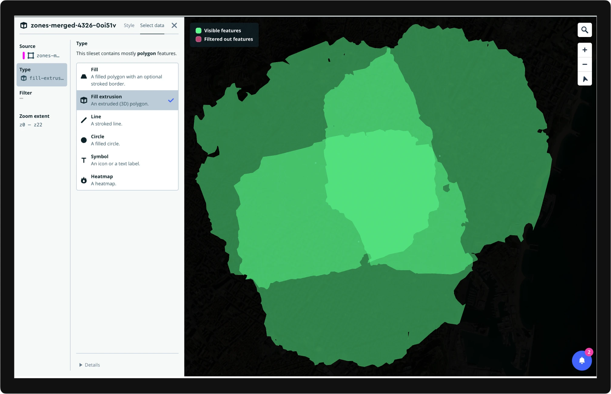
This way, the output will visually appear as a single zone.
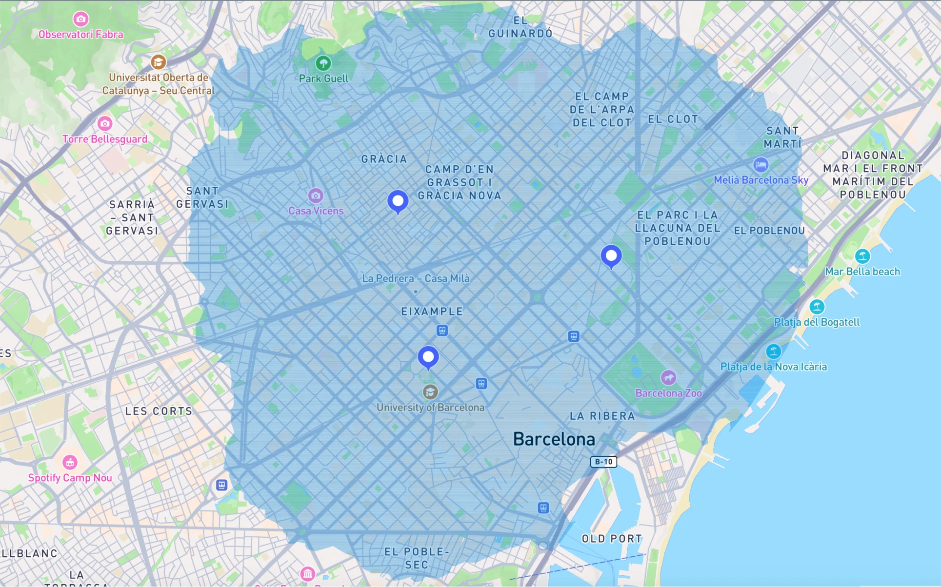
The map prepared in Mapbox Studio
In reality, these are three separate zones, but they look like one. No additional processing is required, just a change in the data display style.
// New style: single zone
// Use "type": "fill-extrusion" as the layer type
[
  {
    "id": "zones-merged-4326-0oi51v",
    "type": "fill-extrusion",
    "paint": {
      "fill-extrusion-color": "#0292f2",
      "fill-extrusion-opacity": 0.3
    },
    "layout": {},
    "source": "composite",
    "source-layer": "zones-merged-4326-0oi51v"
  }
]

// Old style: separate zones
// Use "type": "fill" as the layer type
[
  {
    "id": "zones-merged-4326-0oi51v",
    "type": "fill",
    "paint": {
      "fill-color": "#0292f2",
      "fill-opacity": 0.3
    },
    "layout": {},
    "source": "composite",
    "source-layer": "zones-merged-4326-0oi51v"
  }
]
We encounter this periodically in our projects. For example, for displaying street tours in our audio guides platform tmatic.travel we used the same approach to visualize overlapped tours.
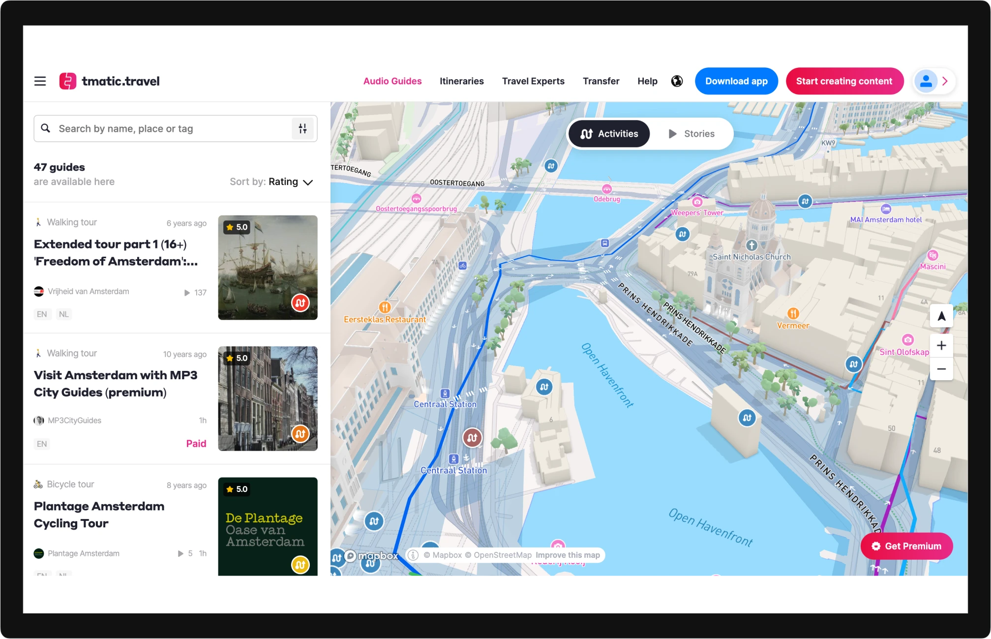
Open the map in tmatic.travel
Conclusion
If you encounter a data visualization problem, it might be solvable through visual methods rather than expending resources on analytical solutions. For instance, in web cartography, this can be addressed through data display styling. Mapbox/Maplibre offers one of the most extensive toolsets for managing map styles.
Related links
